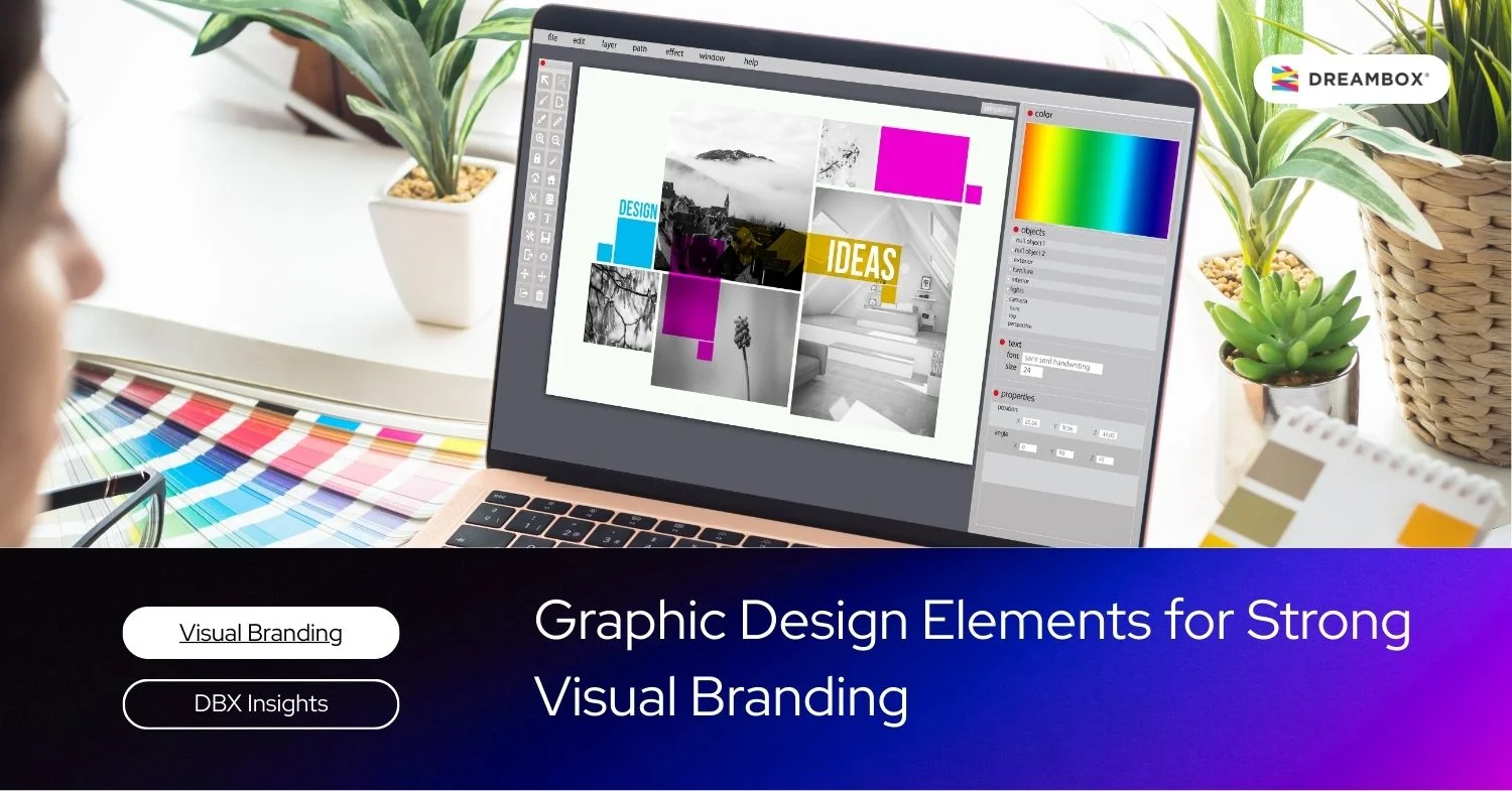
Graphic design elements are not merely about aesthetics; they are about building a foundation of visual communication capable of converting audience perception into brand trust.
For business owners and strategic leaders, graphic design is a navigational tool that ensures your message reaches the right audience in the most effective way. Cohesive visuals reflect the professionalism and the grand vision of your company.
Without a deep understanding of the basic elements of graphic design, your brand risks losing relevance amidst the market noise. Let us dissect how these elements transform your business identity into a legacy.
Basic Elements of Graphic Design
Design is a language. Much like composing articulate sentences, every visual element plays a specific role in creating a narrative that aligns with your business objectives.
1. Points and Lines
A point is the most essential element in the design ecosystem, acting as a visual anchor that draws attention. However, when these points are connected, they form a line. From a strategic perspective, lines function as an eye path for the audience.
Schedule a free 30-minute branding consultation session with our experts.
Do you wish to convey stability with calm horizontal lines, or aggressive growth with dynamic diagonal lines? A line is not just a decoration; it is an instrument to guide audience perception through the information layout.
2. Planes and Shapes
Planes are formed by intersecting lines, creating enclosed spaces with specific psychological characters. Geometric shapes such as squares or triangles are often associated with structure, efficiency, and logic perfectly suited for the corporate or technology sectors.
On the other hand, more fluid organic shapes reflect flexibility and a more human centric approach. Choosing the right shape is a crucial step in aligning visual identity with your brand’s core values.
3. Color and Texture
Color is the most instant emotional communicator. It is capable of evoking specific feelings before the audience even reads a single word of your design.
Texture, meanwhile, provides a dimension of “feel” to the visual surface, whether physically or through visual illusion. The combination of both creates depth that makes a design feel more authentic and authoritative.
Deep Dive: The Role of Color in Design
Psychologically, the selection of a color palette must be based on data and audience profiles. Blue is frequently used to build trust and reliability, while gold or deep black represents exclusivity.
We at Dreambox always audit color usage to ensure that every applied hue has a direct correlation with the brand equity you intend to build. An error in choosing colors can lead to dissonance between the message delivered and the perception received by the audience.
4. Value
Value refers to the level of lightness or darkness of a color. Mastery of this element allows designers to create sharp contrast and the illusion of three dimensional space.
Without proper value variation, a design will appear flat and uninspiring. For a brand, the right use of value helps highlight the most important elements, ensuring your core message does not drown in visual noise.
5. Images / Illustrations
Do the images you currently use translate your corporate vision? Images and illustrations serve as empathy drivers. High quality photography or custom made illustrations demonstrate that your brand values quality.
The use of generic visuals often degrades your business credibility in the eyes of discerning potential clients.
Composition Principles in Graphic Design
Once the basic elements are understood, the next challenge is how to arrange them into a harmonious and impactful whole.
Balance
Balance ensures that the distribution of visual weight in your design is even. You can choose symmetrical balance for a formal and established impression, or asymmetrical for a modern and innovative feel. Good balance creates a sense of comfort for the audience as they consume your information.
Contrast
Contrast is the key to creating striking differences between one element and another. Through contrast, you can emphasize what is most essential, such as the Call to Action (CTA) on your marketing materials. Without contrast, the audience will struggle to find the main point you wish to convey.
Emphasis and Visual Hierarchy
Visual hierarchy is about organizing the order of importance. In an annual report or a company profile, not all information carries the same weight.
Through the adjustment of size, color, and position, we help you direct the audience’s attention to the most crucial strategic messages first.
Space and White Space
Many business owners worry about empty space, but for a strategic visionary, white space is breathing room. Empty space prevents a design from becoming cluttered and helps the audience focus on key elements.
Elegant white space is often an indicator of a premium brand that prioritizes clarity and sophistication.
Typography in Graphic Design
Typography is more than just choosing a font; it is about how your words “sound” visually.
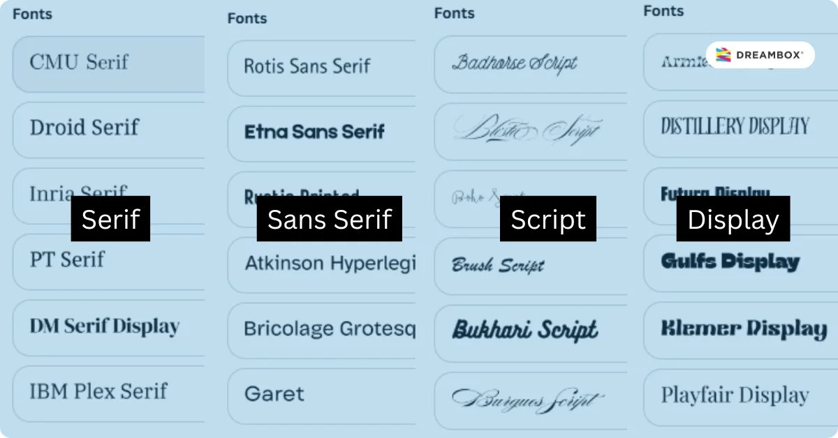
Font Types
Every font category brings a different personality to your brand communication.
Serif
Features small lines (hooks) at the ends of letters. It conveys a traditional, established, trustworthy impression and possesses a sense of legacy. Highly appropriate for financial or legal institutions.
Sans serif
Without hooks, it gives a clean, modern, and efficient impression. These fonts are highly popular in the tech industry and startups that prioritize innovation.
Script
Resembles handwriting, providing a personal, elegant, and sometimes artistic touch. Suitable for brands that want to appear more intimate or luxurious.
Display
Fonts specifically designed to grab attention in large sizes. Usually used for headlines that want to appear bold and unique.
Typography Size and Spacing
Readability is the top priority. Proper settings for kerning (space between letters) and leading (space between lines) will determine whether your message is comfortable to read or exhausting. We ensure every technical aspect is maintained to support your brand’s professionalism.
Font Combinations
Aligning two or three types of fonts requires specific expertise to remain cohesive. The right combination will strengthen the information structure without causing visual confusion.
Conclusion
Mastery of all graphic design elements is the primary foundation in building visual branding that is strong, consistent, and relevant to your brand identity. Great design is not born by accident; it is born from strategic decisions that consider every visual detail to support long term business growth objectives.
Integrated visual branding is no longer an option, but an essential necessity to win the competition in an increasingly competitive market. Does your current visual strategy truly reflect your company’s values and ambitions?
We invite you to transform your business identity through Dreambox Visual Branding services. Let us align your vision with visual execution that delivers real impact. For further strategic discussion on how we can amplify your brand, please contact the Dreambox team or explore more insights through our blog to stay ahead in your industry.